A chart is a visual representation of data or information. It is used to organize and present data in a way that is easy to understand and interpret. Charts are commonly used in various fields, including business, science, finance, and education, to illustrate trends, comparisons, relationships, and patterns in data.
The elements of a chart:
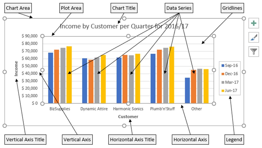
1. Title: A descriptive heading that summarizes the content or purpose of the chart.
2. Axes: The horizontal (x-axis) and vertical (y-axis) lines that establish the scale and categories of the chart, providing a reference for the data points.
3. Data Points: The individual values or data represented in the chart, displayed as bars, points, lines, or other graphical elements based on the chart type.
4. Legend: A key that explains the meaning of colors, symbols, or patterns used in the chart to represent different categories or data series.
5. Labels: Textual information placed near data points, axes, or relevant areas of the chart, providing additional context or identifying specific data.
6. Gridlines: Horizontal and vertical lines that intersect at regular intervals, helping to visually align data points and assist with reading and interpreting the chart.
7. Annotations: Additional notes or comments placed on the chart to highlight specific data points, trends, or other important details, providing further explanation or insights.
These elements work together to present data in a visually organized manner, facilitating clear and understandable communication of information to viewers.

Types of Chart:
Charts come in different forms, each suitable for representing specific types of data. Some common types of charts include:
1. Column chart: A column chart is a type of chart that uses rectangular
bars to represent data values. It is commonly used to compare data
across different categories or track changes over time.
2. Bar
Chart: A chart that uses rectangular bars to represent data values. The
length or height of the bars corresponds to the magnitude of the data.
3.
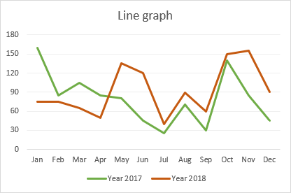
Line Chart: A chart that displays data as a series of points connected
by straight lines. It is commonly used to show trends over time.
4.
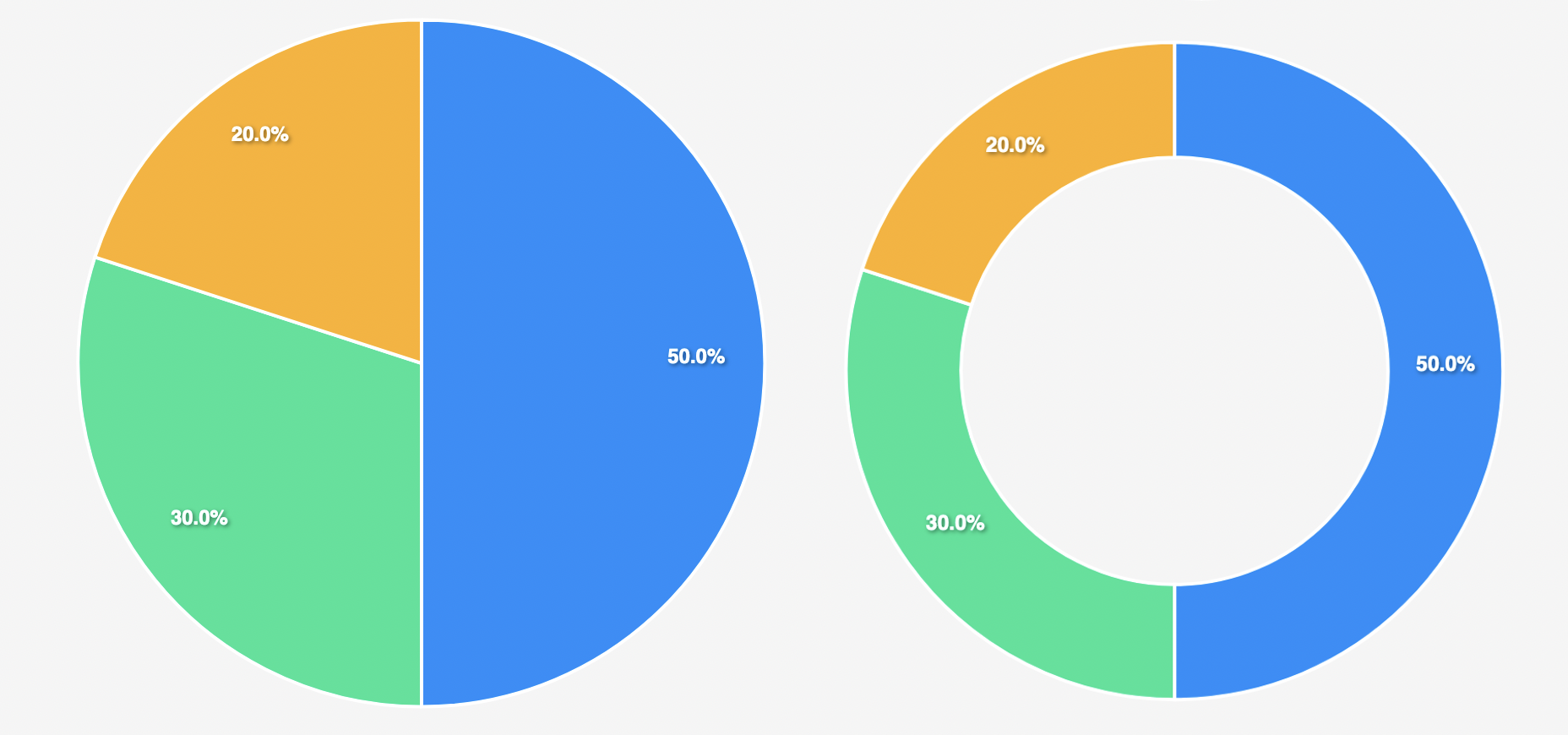
Pie Chart: A circular chart divided into sectors, where each sector
represents a proportion of the whole. It is useful for illustrating
percentages or parts of a whole.
5. Doughnut Chart: A doughnut
chart is a circular chart with a hole in the center that represents data
proportions or percentages in a visually appealing way. It is used to
compare the contribution of different categories to a whole while also
showing their relative sizes.


Step-by-step guide with definitions for creating a chart in Excel:
1. Data: Enter your information into a worksheet, organizing it with labels for each column or row.
2. Select: Highlight the data range you want to include in your chart.
3. Insert: Go to the "Insert" tab and choose a chart type from the "Charts" group. Excel will insert the chart into your worksheet.
4. Customize: Modify the chart's elements, such as the title, axis labels, and legend, to suit your needs.
5. Design: Use the "Design" tab to change the chart type or switch data series, if necessary.
6. Format: Adjust the appearance of the chart by using the "Format" tab, which provides options for colors, styles, and more.
7. Resize and Move: Modify the chart's size and position within the worksheet for better presentation.
8. Save: Remember to save your Excel file to retain the chart and any other changes you have made.


